![]()
New Look Vision is an independently-owned optical shop that will open its doors to the public in late July. Located on the new light rail line at the intersection of Hwy 280 and University Avenue, they offer a wide selection of eyeglasses and prescription sunglasses. New Look Vision strives to carry the most cutting-edge styles (as well as an impressive selection of hand-picked vintage frames) at a price that won’t break the bank.
I recently had the pleasure of working with the companies founder, Younes, to create an online presence for New Look Vision. My company, Blacktop Interactive LLC, started from the ground and worked our way up. We began with the selection of a WordPress template that suited the clients needs. They needed an eye-catching splash page, a functional footer and most importantly, clean and simple eyewear galleries. We decided on Modernize, a responsive theme created by GoodLayers that has clean galleries that will be easy for Younes to add images to when he gets in a new shipment of frames.
Modernize
We wanted the online experience to closely resemble a real visit to New Look Optical’s location in Saint Paul. We visited Younes before the store was complete to get a feel for the shop. There is a fantastic brick wall painted black, high ceilings with red beams and silver accents.
Modernize was a pretty light theme overall, so we darkened it up and for accents we matched the red that Younes painted some of the walls at New Look Vision.
Product Photography
Younes had over 200 frames that he wanted to include on the website (he has more in the store, believe it or not). So we set up a photo shoot in our office and made a system of actions in Photoshop to expedite the process. We were up to our elbows in eyeglasses, but we processed all 200 images in less than a day.

Branding
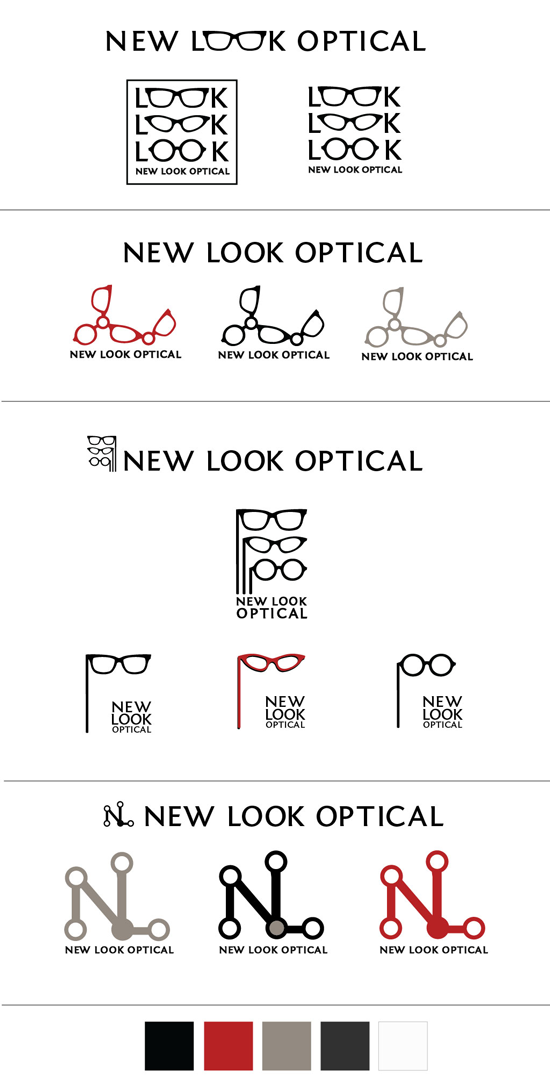
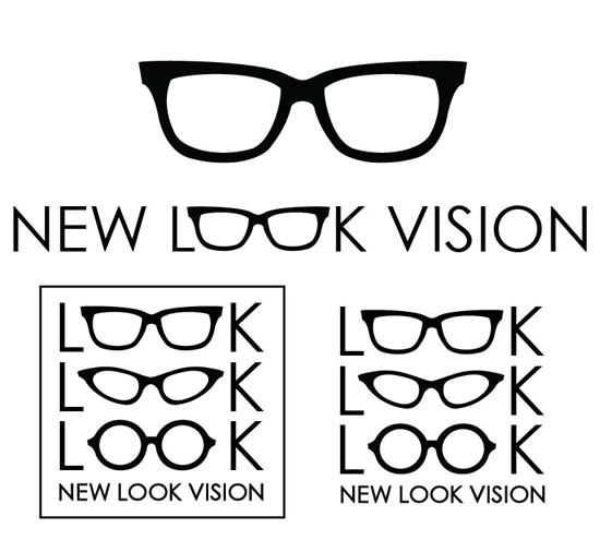
So we had our theme and content, but we needed a simple, modern logo to pull everything together. Younes was a designer’s dream to work with. He gave us some direction, examples of logos and fonts that he liked and left the rest up to our creativity. We came up with four logo iterations riffing off of the colors in the store and contemporary frame shapes.

Younes liked the top logo the best, but wanted to see it with some different fonts. We sent him five variations with different fonts and he ended up choosing Century Gothic for the final logo.

Check out our work for New Look Vision online at www.newlookvision.com and at their new location at 2484 University Avenue West! Are you ready for a new look? Their grand opening is on Tuesday, July 24th and they are offering some great deals! You can also find New Look Vision on Facebook.

